Introduction: Your Homepage Is Your Digital Handshake
Imagine walking into a shop with cluttered shelves, flickering lights, and a grumpy shopkeeper. That’s exactly how your homepage feels if it’s slow, confusing, or ugly. Darren used to think slapping flashy images and popups on his homepage was clever — but his customers fled faster than a startled carp. He needs to check out his Homepage SEO and user experience.
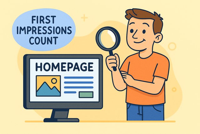
Your homepage is your website’s front door. It’s the first thing visitors see, and first impressions count more than you think. If it doesn’t load quickly, look professional, and guide users naturally, you’re losing sales — plain and simple.
This review will walk you through why homepage SEO and design matter, how Darren lost sales with bad UX, and what you can do to keep visitors hooked.
1. Why First Impressions Matter in SEO and User Experience
Studies show that users form an opinion about your site within 50 milliseconds — that’s quicker than a blink. A confusing layout or slow loading time can spike bounce rates, and higher bounce means Google sees your site as less relevant, dropping your rankings.
Darren’s homepage loaded in 11 seconds. Visitors got fed up and left before seeing a single fishing rod.
Metrics to Watch:
- Bounce rate above 70%? Danger zone.
- Average session duration below 30 seconds? Users aren’t engaged.
- Conversion rates falling? Your homepage isn’t convincing.
If users don’t trust your site or can’t find what they need fast, they won’t buy — simple.
2. Speed Kills (Your Sales)
Speed is a ranking factor for Google and a user killer. Darren uploaded massive, uncompressed photos of trout that slowed his site to a crawl.
Why Speed Matters:
- 53% of mobile users abandon sites taking longer than 3 seconds.
- Every 1-second delay reduces conversions by 7%.
How to Fix:
- Compress images with TinyPNG or Squoosh.
- Use lazy loading to prioritize visible content.
- Enable browser caching and use CDNs.
- Choose fast hosting and lightweight themes.
Darren fixed his speed issues and saw a 35% drop in bounce rate.
3. Navigation and User Journey: Don’t Make Visitors Guess
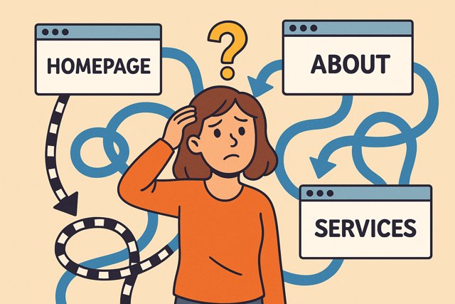
Darren’s navigation was a mess — visitors clicked around aimlessly or gave up. Clear menus, search bars, and obvious CTAs (calls to action) are essential.
Best Practices:
- Limit main menu items to 5-7.
- Use descriptive labels like “Carp Rods” not just “Products.”
- Place a visible search bar top right.
- Include “Buy Now” or “Shop Our Range” buttons above the fold.
Good navigation guides visitors smoothly to their goal — whether browsing, learning, or buying.
4. Pop-Ups: Friend or Foe?
Darren’s homepage bombarded visitors with pop-ups: newsletter sign-ups, cookie notices, and a discount offer — all at once.
Why That’s Bad:
- Pop-ups that interrupt or frustrate cause users to leave.
- Google penalizes sites with intrusive interstitials, especially on mobile.
- Pop-ups hide content and harm accessibility.
Tips:
- Use timed or exit-intent pop-ups sparingly.
- Make pop-ups easy to close with a clear “X.”
- Test mobile usability after adding pop-ups.
5. Calls to Action: Make Them Clear and Compelling

Your CTA is the bait — the hook to reel customers in. Darren’s CTAs were tiny and buried below the fold, like hiding his best rods under a tarp.
What Works:
- Place CTAs “above the fold” — visible without scrolling.
- Use action verbs: “Shop Now,” “Get Your Free Guide,” “Call Us Today.”
- Make buttons big enough for tapping on mobile.
- Use contrasting colours for CTAs to stand out.
6. Darren’s Homepage SEO Blunders: A Quick Recap
- Slow loading images
- Confusing navigation
- Too many pop-ups
- Weak CTAs
- No clear value proposition above the fold
Fix these and your homepage becomes a sales magnet.
7. The Psychology of Colours: More Than Just Pretty Shades
Colours aren’t just about aesthetics — they affect emotions, trust, and behaviour. Darren ignored this, slapping neon pink and bright green all over his homepage. Visitors felt like they’d wandered into a dodgy nightclub — and bounced.
7.1 How Colours Influence User Behaviour
- Blue: Trustworthy, calming. Many financial and tech companies use it to build confidence.
- Red: Urgency and excitement, good for CTAs like “Buy Now” or “Limited Offer.”
- Green: Growth and health, great for eco or outdoor brands (think fishing tackle, Darren!).
- Yellow: Attention-grabbing but can cause anxiety if overused.
- Black/White: Classic, elegant, and clean — helps balance brighter colours.
7.2 Best Practice for Homepage Colours
- Use 2-3 primary colours consistently.
- Make CTAs stand out with a contrasting colour (e.g., blue site with red button).
- Avoid harsh, neon combos that tire eyes and cause confusion.
Darren’s makeover included swapping his eye-burning neon for a calm blue-green combo, and guess what? Visitors lingered longer.
8. Font Choices: Size, Style, and Readability Matter
Fonts do the heavy lifting in delivering your message clearly and keeping visitors engaged. Darren, however, picked Comic Sans for his headers — a decision that made even his mum cringe.
8.1 Why Font Size and Style Impact SEO and UX
- Readability: Text that’s too small or cramped frustrates users. Recommended body text size is 16px or larger.
- Font type: Serif fonts (like Times New Roman) are traditional but harder to read online; sans-serif (like Arial, Helvetica) is cleaner and better for screens.
- Boldness: Use bold for emphasis but sparingly. Too much bold is like shouting at visitors.
- Line height and spacing: Adequate line spacing (around 1.5) improves readability.
8.2 Darren’s Font Fixes
He switched to a simple sans-serif font at 18px body size, used bold only for key points, and added generous line spacing. Result? Visitors stopped squinting and started reading.
9. Structure & Content Hierarchy: Guide Visitors Naturally
Your homepage’s content structure is like a map for your visitors. Poor structure is like handing them a treasure map with no X marking the spot.
9.1 Headings: Your Content’s Road Signs
- Use only one H1 tag per page (usually your main headline). Darren had three. Confusing for Google and humans alike.
- Use H2s for sections, H3s for sub-sections — this logical hierarchy helps scanners navigate your page.
- Consistent heading styles improve visual flow and user comprehension.
9.2 Boldness & Highlighting
- Use bold text to highlight key benefits or action points.
- Avoid bold walls of text — it overwhelms and loses impact.
9.3 Short Paragraphs & Bullet Points
- Break text into digestible chunks.
- Use bullet points to list features, benefits, or steps. Darren’s 500-word paragraphs were a nightmare for readers.
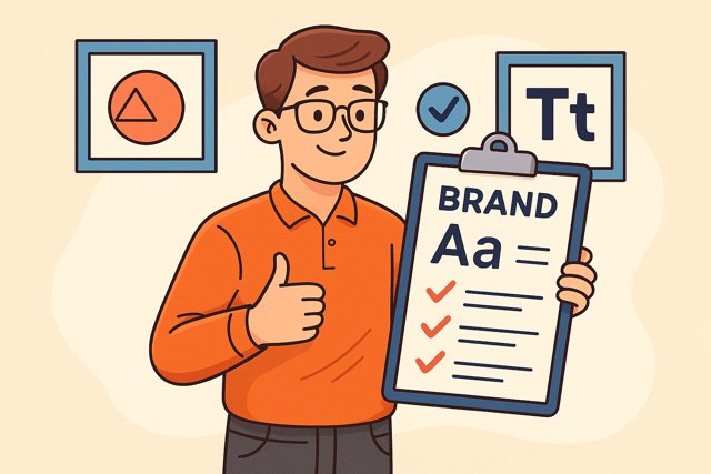
10. Typography & Branding: Consistency Builds Trust
Typography isn’t just about font choice; it’s about how consistent your text styles are across your homepage and website.
10.1 Why Consistency Matters
- Helps visitors recognize your brand instantly.
- Avoids visual chaos that leads to mistrust.
- Supports your brand personality — formal, playful, modern, traditional.
10.2 Darren’s Typography Guidelines
He picked two fonts — one for headings and one for body — and stuck to them. Colour schemes and font sizes matched the overall vibe of his fishing tackle brand: trustworthy, approachable, and professional.
11. Colour Contrast and Accessibility: Don’t Leave Anyone Behind
Good design isn’t just about looks; it’s about making your homepage usable for everyone — including people with vision impairments.
11.1 What Is Colour Contrast?
It’s the difference in brightness between text and background. Low contrast means hard to read, leading to frustration and bounce.
11.2 Accessibility Best Practices
- Ensure text contrasts at least 4.5:1 against the background.
- Use tools like WebAIM Contrast Checker.
- Avoid colour combos that are problematic for colour-blind users (e.g., red/green).
- Include alt text for images to help screen readers.
Darren used to ignore this, making his green text on dark green background unreadable. After fixing contrast issues, his engagement metrics improved.
12. Visual Consistency: The Glue That Holds Your Homepage Together
Visual consistency across your homepage means using a unified style for colours, fonts, button shapes, and spacing.
12.1 Why Visual Consistency Matters
- Builds brand recognition
- Reduces cognitive load — visitors don’t have to relearn your style on every scroll
- Enhances professionalism
12.2 Tips to Achieve Consistency
- Create a style guide for your homepage design.
- Use templates or page builders that enforce consistent styles.
- Darren’s site went from a patchwork quilt of styles to a clean, cohesive design — and visitors noticed.
Conclusion: Design Is SEO’s Best Mate for a Killer Homepage
SEO is about keywords and links, sure — but design, typography, and user experience are equally critical. Darren learned that even the best SEO efforts falter if his homepage confused or scared off visitors.
By mastering colour psychology, font readability, content hierarchy, and accessibility, you create a homepage that’s not just search-engine-friendly, but people-friendly — the ultimate combo.
So next time you update your homepage, think beyond keywords. Think about how it feels, looks, and guides your visitors. Darren’s sales wouldn’t have bounced if his site was designed with humans in mind — so make sure yours is.
Leave a Reply